Case Study/Categories/Wellness
Lumina Wellness
A quieter brand for people trying to slow down.
Calm is easy to claim and very hard to design.
Overview
Calm is easy to claim and very hard to design.
Lumina Wellness opened its first studio into a category that had learned to sell rest the way everything else is sold — loudly, urgently, and with a countdown timer attached. The founders wanted the opposite, and knew that saying so was not the same as being it.
Our role was to build an identity that behaves the way the studio does: unhurried, legible, and warm enough that the first visit feels like a second one.
Rest is not a product feature
Wellness branding has a habit of borrowing from the industries it claims to be an antidote to — the same urgency, the same scarcity, the same promises measured in weeks. Lumina's audience had already seen through it. What they responded to instead was specificity: what happens in the room, how long it takes, who is in it with you, and what it costs. The brand's job was to answer those plainly and then get out of the way.
An identity that can hold still
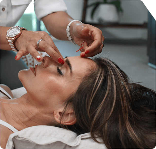
Every decision was made against a single test: does this ask the reader for anything? Generous margins, one typeface used at three sizes, a palette taken from the studio's own materials, and photography that shows the treatment rather than a model's reaction to it. The system is deliberately small, because a small system is one a two-person team can actually keep consistent across a year of posts, price lists and signage.
Our brand promise
We give you back the hour you booked, and nothing you didn't ask for. It sets the standard for the studio's own behaviour first — no upsell at the door, no rebooking pressure — and for everything the brand says second.
Categories
Lumina Wellness
A quieter brand for people trying to slow down.
Calm is easy to claim and very hard to design.
Lumina Wellness opened its first studio into a category that had learned to sell rest the way everything else is sold — loudly, urgently, and with a countdown timer attached. The founders wanted the opposite, and knew that saying so was not the same as being it.
Our role was to build an identity that behaves the way the studio does: unhurried, legible, and warm enough that the first visit feels like a second one.
Rest is not a product feature
Wellness branding has a habit of borrowing from the industries it claims to be an antidote to — the same urgency, the same scarcity, the same promises measured in weeks. Lumina's audience had already seen through it. What they responded to instead was specificity: what happens in the room, how long it takes, who is in it with you, and what it costs. The brand's job was to answer those plainly and then get out of the way.
An identity that can hold still
Every decision was made against a single test: does this ask the reader for anything? Generous margins, one typeface used at three sizes, a palette taken from the studio's own materials, and photography that shows the treatment rather than a model's reaction to it. The system is deliberately small, because a small system is one a two-person team can actually keep consistent across a year of posts, price lists and signage.
Our brand promise
We give you back the hour you booked, and nothing you didn't ask for. It sets the standard for the studio's own behaviour first — no upsell at the door, no rebooking pressure — and for everything the brand says second.
Other Case Studies